In 1979 Alexander Schauss, the director of American Institute for Biosocial Research asked the management of penitentiary center in Seattle to carry out a certain experiment. The response to it wasn’t too enthusiastic as the study was breaking taboo and questioned the generally-applicable norms. Despite some resistance the idea came into light and its results changed the American prison system forever.
The most controversial point to the changes was painting the prison cells… pink. The doubts were obvious: the colour, perceived to be girly, infantile some may say, was introduced into a brutal, man’s world. Turned out after only 15 minutes of being surrounded by pink walls level of anger in inmates was reduced. Furthermore, looking into a pink board for one minute was resulting in men pressing the dynamometer with less strength than when exposed to a navy board. As a consequence of the experiment the most problematic prisoners had to live in pink cells. For the seven consecutive months not one act of violence was reported among those men.
Other penitentiary centres in America implemented Schauss’s study, while European countries used 'the pink walls' idea during court meditations. As one may expect, similar practices and results can be achieved in a work environment.
Not a taboo
It is the only warm colour that has a calming effect, however, more saturated shades of pink have stimulating properties.
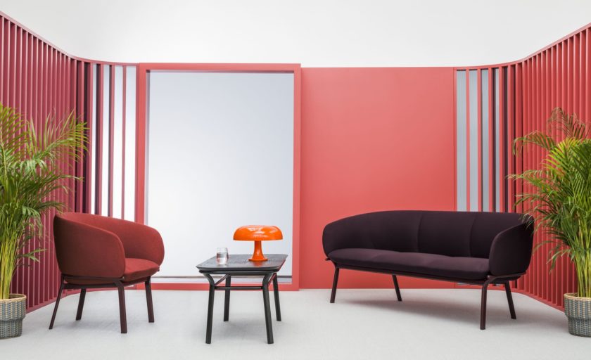
Until 1940s pink was perceived as neutral and only later labelled and reserved to boudoirs and children’s rooms. Nowadays those kind of prejudices are a thing of the past but its still best to use it carefully in a professional environment, either only on the walls or in the form of decorations. It is also safer to use bolder variants of pink- ones similar to reds and purples. Popular shades are: raspberry, magenta and pink with a hint of brown.
The colour helps to control emotions and reduces anxiety levels in any interior. It will be suitable in chillout rooms and areas with a higher risk of stress.
Towards the energy
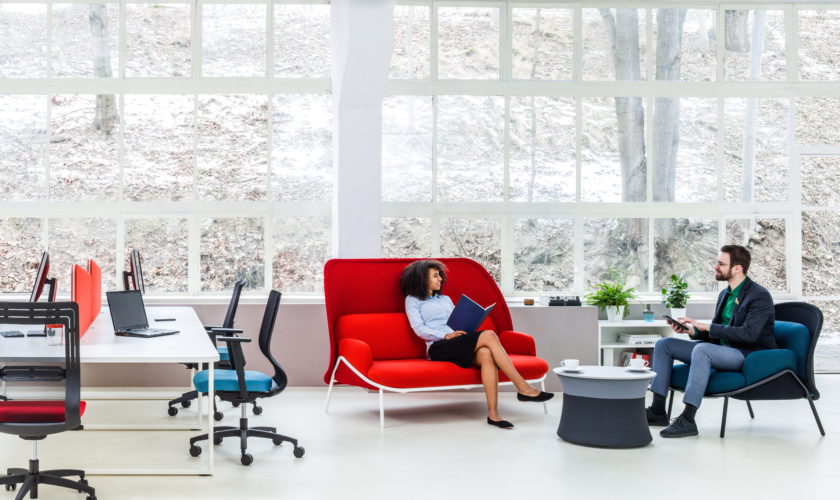
Red affects us in a completely different way. It connotes sensuality and elegance, especially when a 'business shade' of red is used or a colour of a 'brave lipstick'. In an employee space it symbolizes creativity and dynamism.
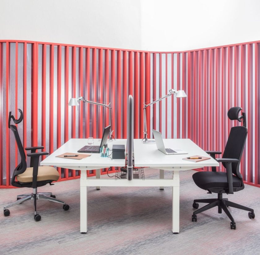
It has to be noted, however, that it’s a colour of warning messages and alerts, people involuntarily associate it with aggression and dominance. Study conducted at the Rochester University proved that students who saw a red 'please knock' sign knocked with less power that when introduced to a green coloured sign. Red appearing during logical reasoning tests was causing the participants to draw back their heads, which was a non-existence behaviour when presented with other colours. Its due to the fact that people in general withdraw and run away from an experience if not comfortable.
On the basis of the same experiment it was proven that when using a red instead of a black marker students were making hasty and usually wrong decisions. Red activates an area of brain responsible for emotions that also empowers short memory, but simultaneously reduces intellectual and motor skills.
The right dosage
With that knowledge we can consciously dosage red in a workspace. It is safer to use it on furniture and accessories rather that walls, though no other measure will lighten a dark room like paining it one colour.Strong, mobilizing colour will perform best in places we need to act fast, in conference rooms, areas designed to team work and brainstorm. Painting the reception area or a business entry red will indicate a modern and a professional firm. Red sofas and chairs suggest a powerful and well-established leader. The colour shouldn’t be used in places where conflicts and emotions are unwanted. In conference rooms red encourages honesty, communication and brainstorming but we need to remember it also reduces effectiveness of in-depth analysis.
Good partnership
Each arrangement requires a skilful colour coordination.
Pink matched with grey creates one of more neutral combinations, while with black give a sense of sophistication. Pink with all shades of blue and green are a stylish and a unique partnership.
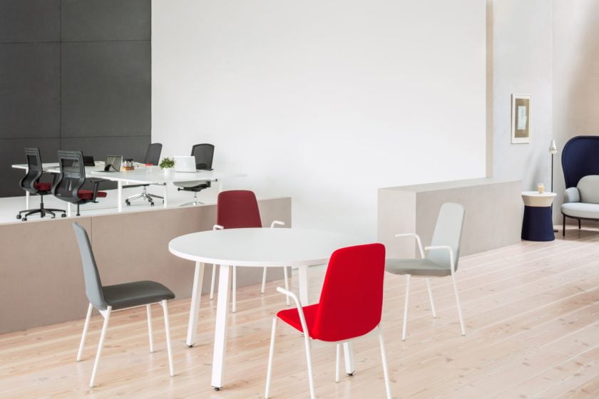
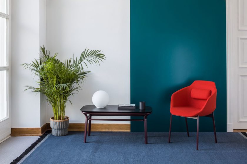
Red combined with subdued colours of grey, blue or green are an engaging variant while in more dynamic places combinations of red with navy and red with black are a striking and interesting look. Last but not least, red has the power to break and bring to life any Minimalist white.
Comments