In a vast majority of cultures black is associated with magnitude and authority but also bereavement and a sense of loss. It doesn’t belong to the natural palette of colours, therefore, contrasts strongly with its surroundings. It’s quite difficult to use its full potential in interior design.
Feng Shui assigns black the power of building authority. Europeans also see it as a sign of prestige. Homeware and technology manufacturers skilfully use black casing and stainless steel to portray sophistication and efficiently directed at wealthier consumers. The colour, usually used in products dedicated to men, displays high quality, modern technology and efficiency.
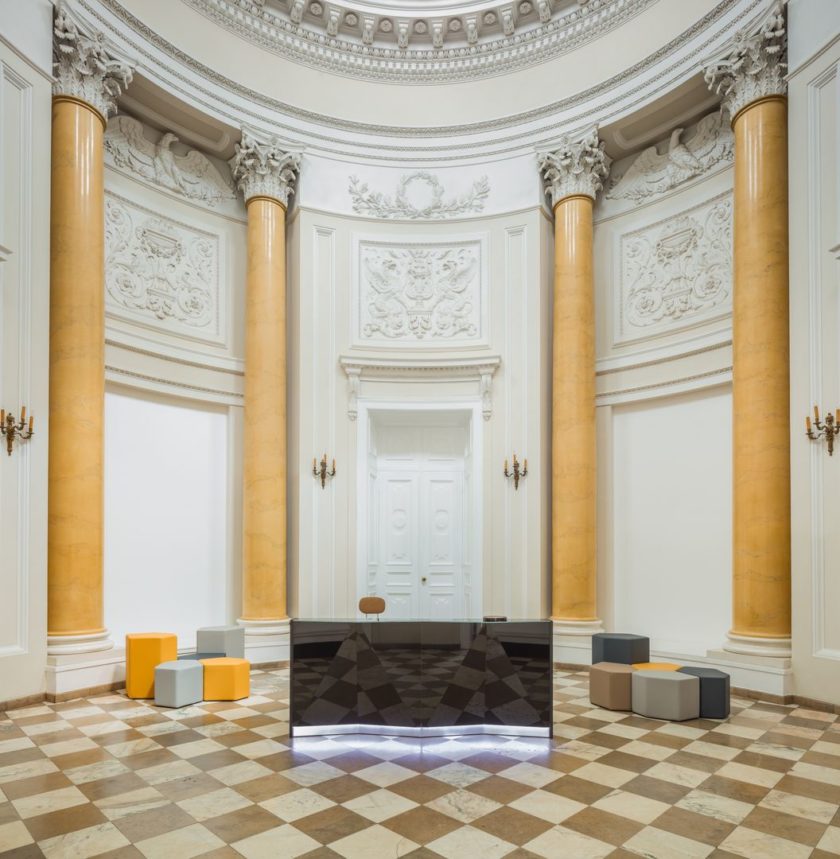
Black colour when worn covers up imperfections. However, in interior design works the other way around. It catches the eye and performs excellently in representative places aimed at impressing its guests, like reception areas and executive offices.
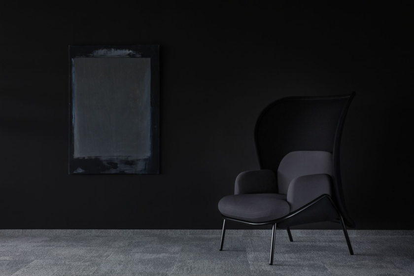
Black absorbs light and excess of it can create a hostile and unpleasant place to be in. It doesn’t encourage interpersonal relations but causes withdrawal. Used expertly in chillout area helps to relax and unwind.
To eliminate unnecessary connotations of black we can break it with other colours, details and textures. When paired with aggressive red- black becomes dynamic, which is successfully exploited by car manufactures. Accompanied by white, silver and gold- elegance and a touch of extravagance is ensured. Visually attractive combinations of black and yellow; black and greens; timeless greys; whites and shades of blue- will all create an interesting and exciting space. What’s worth remembering is that the severity of the colour can be easily broken with natural wood.
Black stands out and helps to builds a company’s authority. It is not universal but still manages to take an active part of contemporary lofts, classic, minimalist and Scandinavian trends.
Comments