The end of the year is the time when interior design specialists set the upcoming trends, which determine the office arrangements as well. Colour inspirations are a crucial element of those forecasts.
Pantone’s colour of the year
The experts of Pantone Color Institute named Living Coral the colour of 2019 – nice to look at and very optimistic colour. This shade as well as its all similar variants are softly making the interior more alive and warm. They especially compose well with nature colours.
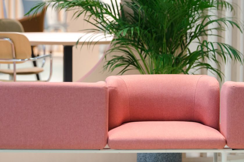
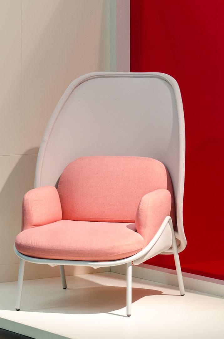
However, it would be considered to be a restriction to allow the dictatorship of solely one colour. That is why Pantone Color is introducing 72 proposals that are grouped into 8 palettes. These are dominated by shades of brown with a strong emphasis on the ones that are associated with the sense of taste (Cappucino, Chocolate and Butterum), the red of spicy peppers along with orange and green. You can also find grey colours. Pastels are also considered to be an important part of the Pantone’s palettes.
PPG Industries’ green
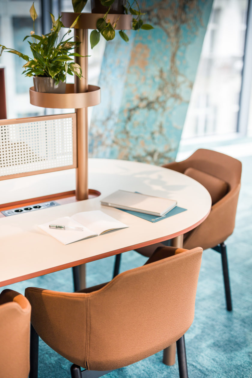
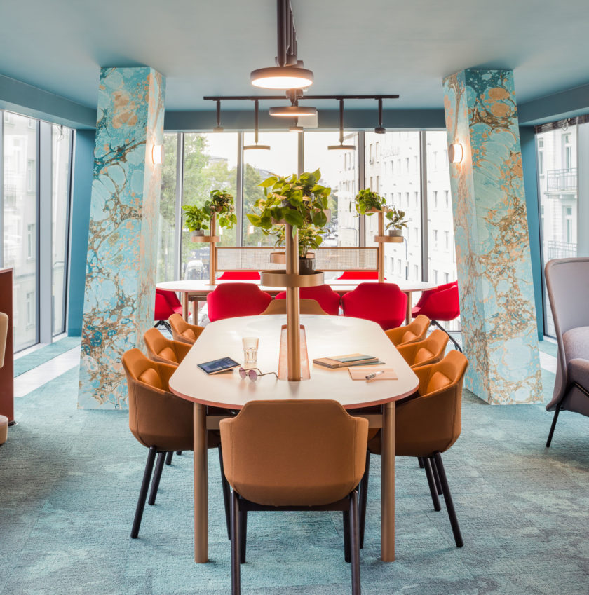
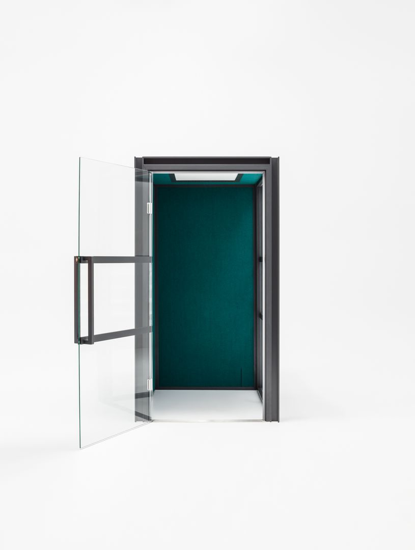
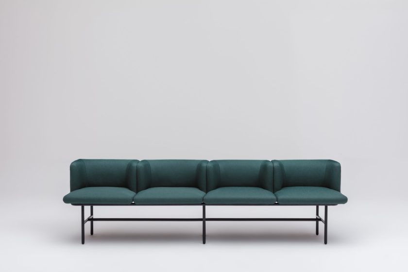
The representatives of Pittsburgh Plate Glass Industries together with interior design specialists have also prepared their colour proposal. To their mind the most fashionable colour in both public and private areas will be Night Watch green – dark and perfectly composing with various styles: from minimalistic to boho. Introduced into an interior it creates an elegant character, which favours harmonious well-being. This trend is not completely new – Night Watch green has already appeared in arrangements, nevertheless, it truly gain in importance in 2019 and repeatedly played first fiddle. Night Watch can be combined with beige, brown, grey, and metallic colours.
Global Aesthetic Center
Global Aesthetic Center also proposes colour trends yearly. This year Spiced Honey is in the centre of interest – it is neutral enough so that addition of accompanying colours can change its character completely. Taking advantage of this rule, Global Aesthetic Center created four sets of colours, that are complementary to the main hero and affect its influence.
The names of the palettes are very characteristic and refer to activities and emotions that are associated with them. Think palette – pastel colours filled with deep azure and strong claret – favours creativity and concentration. Pink and azure colours appear in Dream collection and make the interior relaxing and calming. Love colours are: warm and intensive red, orange, claret, dark green, and cyan. The last but not least is the Act palette that consists of joyful azure, neutral grey and energetic red and green.
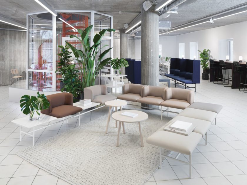
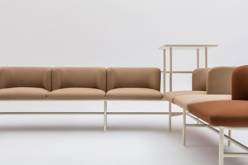
2019 is not only about Coral Living. The previously mentioned examples show that there are many possibilities. Our Lifespace philosophy does not impose just one solution. The most important thing is that the colour matching results from the specificity of the particular office area and individual preferences of the users. Inspirational suggestions are only hints, among which both living colours lovers and those that go for strong colours can find something for themselves.
Comments