Reception is a place that represents the brand. However in space planning it is not about ostentation but integrity with trade specificity and image of the company. Our opinion is determined by the first and last impression of the reception but a clear divide between the instant feeling and the whole experience may result in an incoherent depiction of the brand.
“Contemporary reception desk is not a barrier from unwelcome guests, its role is not limited to a waiting area or the work station of the administrative staff anymore. It is an important element of building a brand image. It invites you and initiates contact. Reception area should mirror the philosophy of functioning and the character of the company. Do not underestimate it and take care of the integrity of individual zones in the office”- explains Natalia Marciniak from MDD.
A key element of a reception area is the desk. It is worth looking at modular systems before making any decision. They allow you to create space that fits in with the character and size of the interior. Ordering bespoke products often result in higher costs and much longer waiting time. Modular desks connect the strengths of both- a customised project and a standard one. They also provide the user with comfort that translates into work quality.
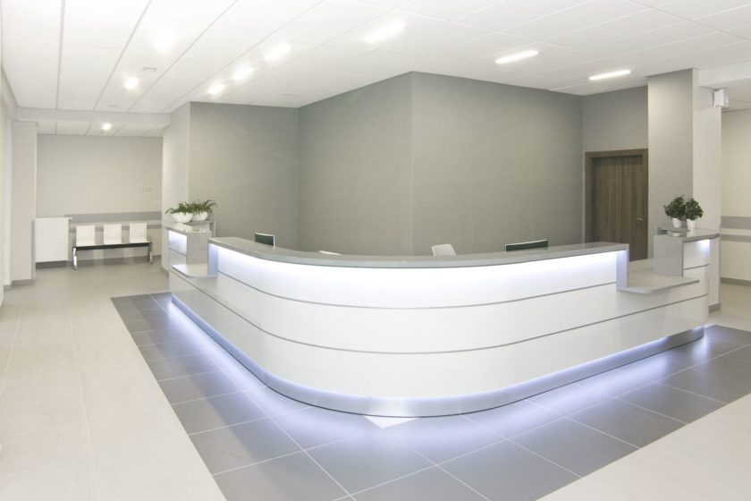
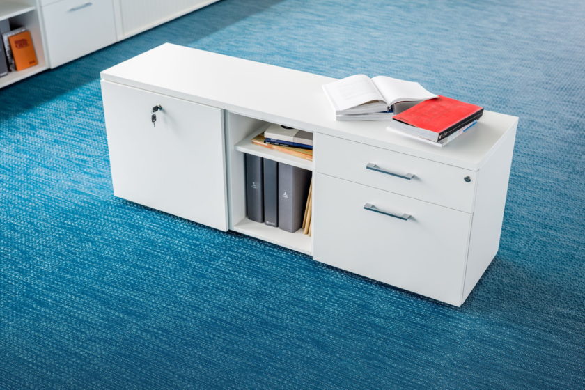
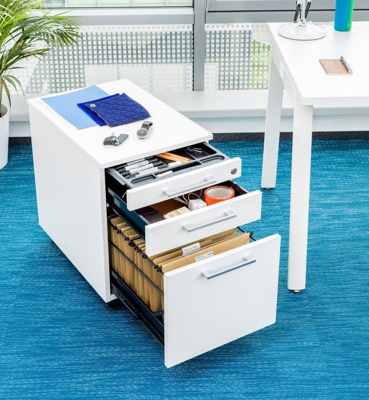
Functionality of the reception desk is completed by additional furniture, like cabinets and containers that solve the issue of documents and personal belongings piling up. The number and exact variant of modules depend on the function of the reception desk. With only a representative role of the desk smaller cabinets and containers will be sufficient, but if the area of operations is larger more storing space will be needed. We should fit the waiting areas with cabinets and clothes hangers that can be used by clients. Consistency of the design is key in brand image. Bolder interiors can be fitted with glossy fronts and striking colours, while neutral colours work well with classic arrangements.
Minimalism is very popular at the minute. It works perfectly with classic elegance, in modern offices and lofts. It requires space and according to the rule of “less is more” it restricts furniture and objects from appearing too often. It uses mostly white and grey shades that are underlined by glass and glossy fronts. If there is any decoration, it will be in the form of an eye catching designer element, like for example a characteristic lamp. In medical institutes skilfully balanced minimalism highlights the order, cleanliness and sterility of the place. Technology firms can use the trend to underline their progress and compatibility with modern world. Minimalism does not overwhelm or intimidate but brings light and elegance into a space.
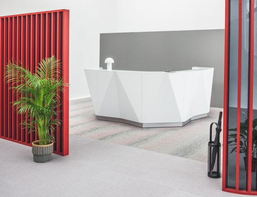
Companies that operate in the creative industry can play with form and reach for unconventional solutions. They do not have to give up on the Minimalist trend. All we have to do is break it with striking elements like bold decorations and unique soft furniture in the waiting area. Thanks to modular, separated from communication routes furniture we can create a less formal character of the space.
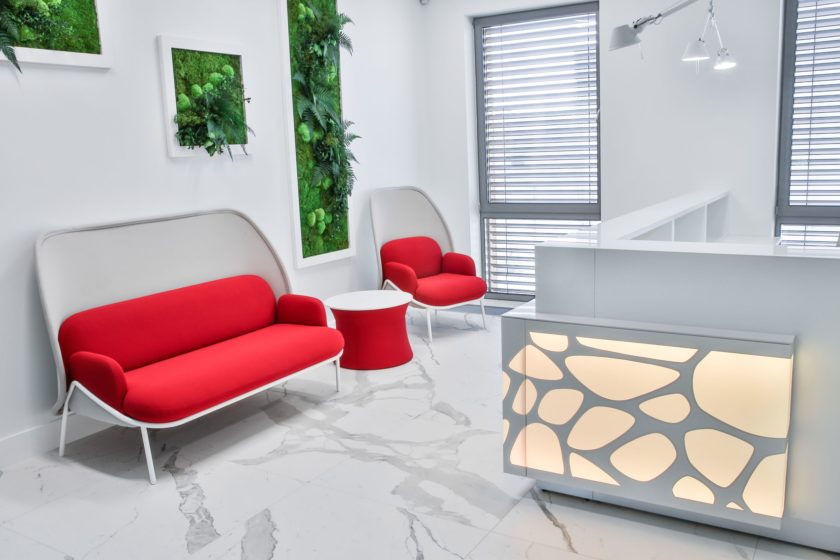
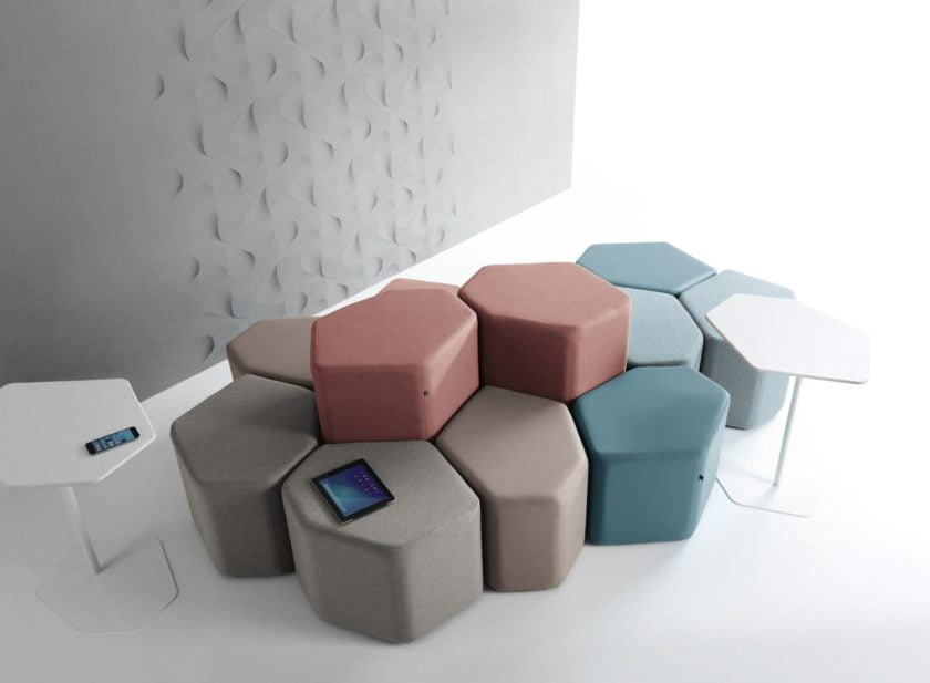
Reception desks with expressive colours and laminated fronts work well in editorial offices, advertising and marketing agencies. Skilful selection of colours can refer to the corporate colours or a brand logo, which makes the desk consistent with a company’s visual identification.
Some firms, like for example legal offices still use the classic solution. The decision is partly dictated by the specificity of the profession and also by the character of the building. Law firms and legal offices are often located in historic buildings and use its characteristic architectural elements. Elegant and timeless furniture will highlight the gravity of the place and authority of the people working in it. They build a sense of trust. You can create an atmosphere of classic office through dark colours and wooden details of the reception desk. The waiting area fitted with soft furniture and classic proportions will complete the desired look.
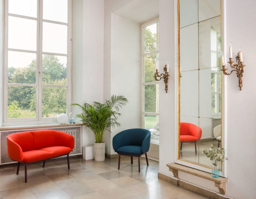
Regardless of the direction we choose, arrangement of the reception area should be compatible with interior design of the remaining office and a company image. Owners of buildings and firm representatives more often realise that the look of a reception area is an important element of the whole image strategy.