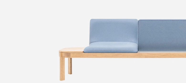
Blue is a well-liked, timeless and engrained in every culture colour. That is a bold statement, however, proved by extensive research. According to Lee Ellis and Christopher Fick study 45% of surveyed men pointed out blue as their favourite colour. Women chose it second with green(24,9%) being their number one.
Fresh minimalism
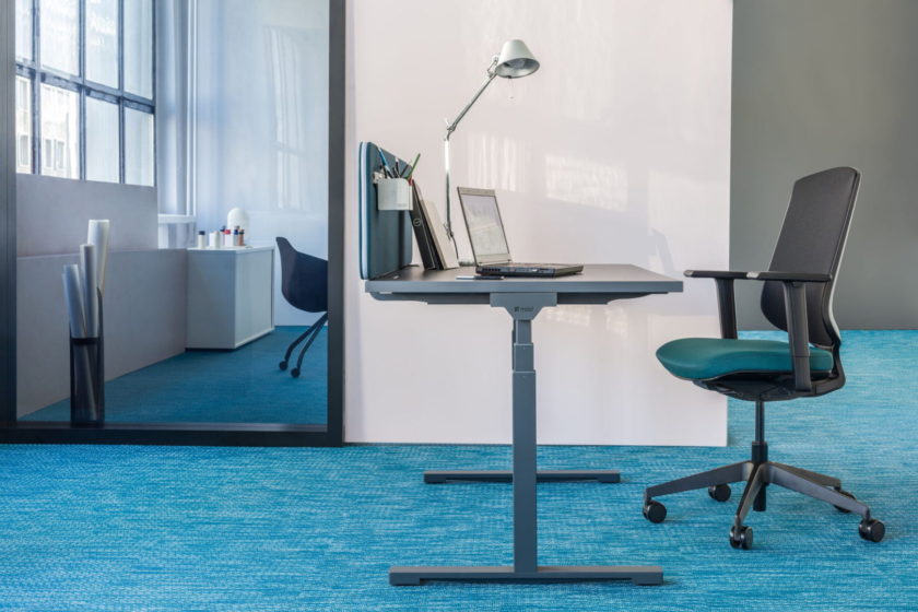
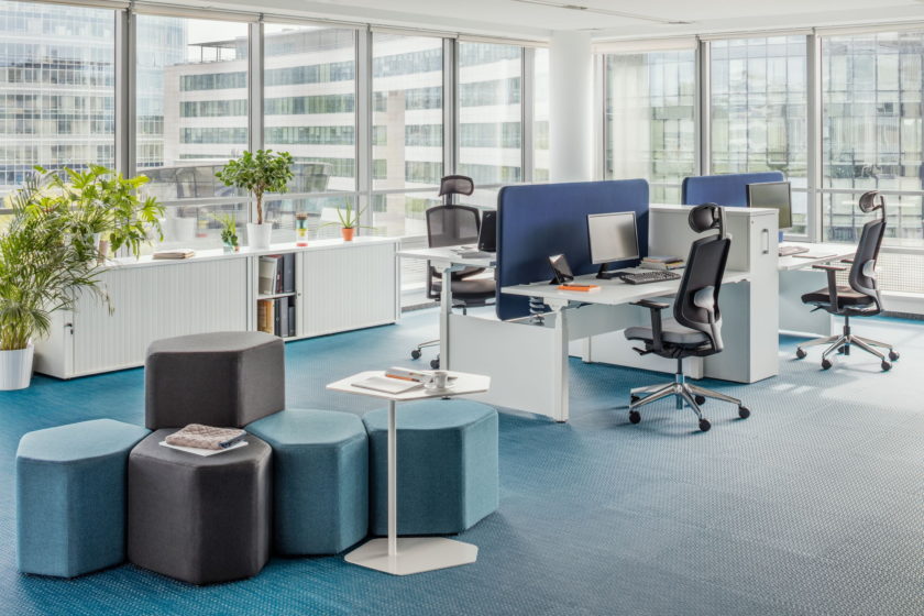
Blue being one of cool colours brings freshness into any space. It works perfectly in workspaces as it improves employees’ mental health and encourages them to act. It blocks the production of melatonin responsible for sleepiness, helps with concentration and raises vigilance. Car manufacturers frequently install blue light to illuminate the dashboards of their vehicles. The colour doesn’t tire eyes and improves mood, which Japanese railway successfully used by installing blue lights along railway tracks to reduce the suicide rate.
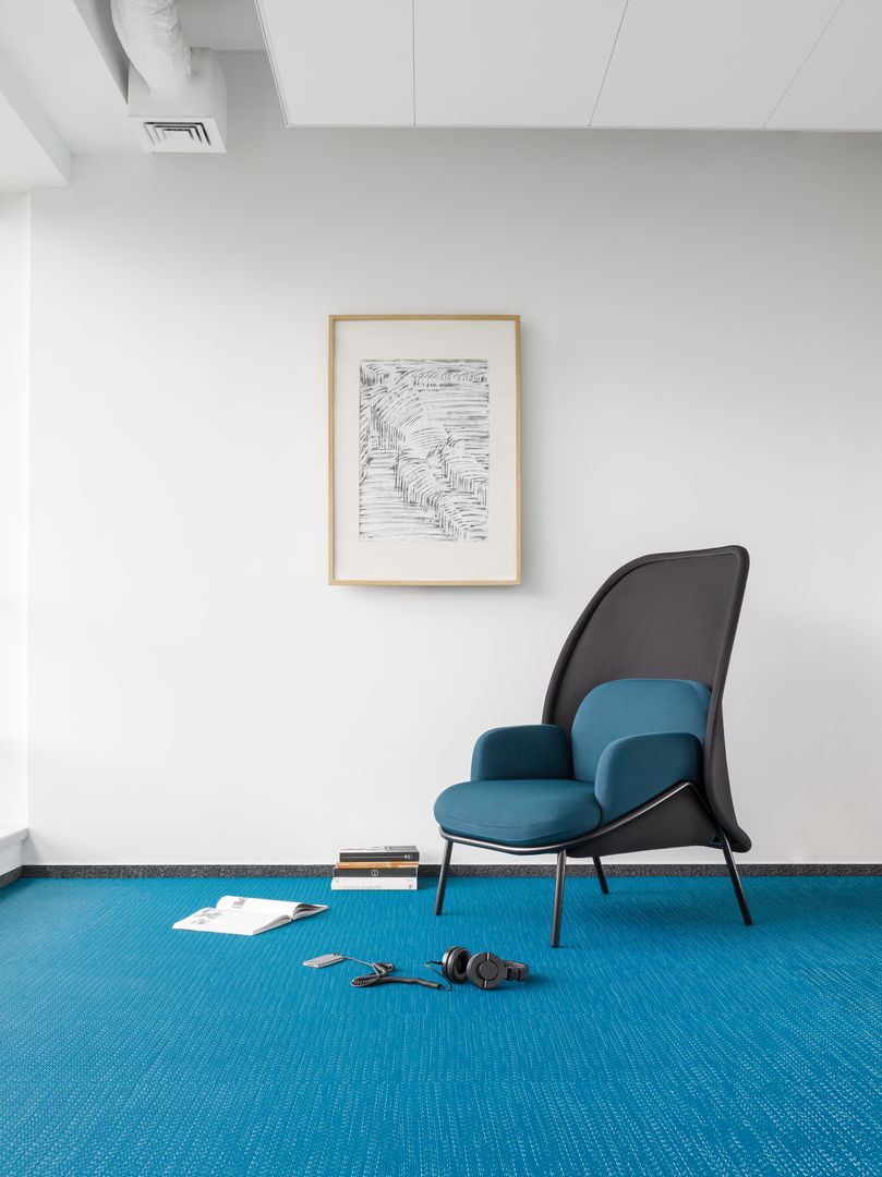
To obtain the optimal result you need to choose the right shade of the colour. Light and even blurred hues of blue improve motor skills and stimulate cognitive development. It is particularly beneficial to managers, directors and people who need to make decisions on the spot. Pale colours have calming and relaxing effect, they work perfectly in chill out zones. Due to their “numbing effect” you need to cautiously use them in everyday space, unless it is a dynamic and nervous environment where calming your emotions is advisable.
Energy and creativity
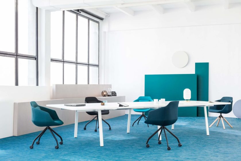
Darker shades of blue have a slightly different character: cobalt blue, Prussian blue and Ultramarine are energetic, boost creativity and fit into spaces of artists, architects and designers. They are the best alternative to red colour. Nancy and Carlo Lewis from the University of Texas proved in their study that individuals who sit in front of a blue area have twice as many ideas as employees who are facing e.g. red wall. Those who played with blue Lego bricks used their creativity, whereas, people whose bricks were red followed their practical reasoning instead.
Paired well
You can achieve the look you desire by skilfully matching blue with other colours. Blue harmonizes perfectly with white, an arrangement associated with fresh and clean environment. The colour combination is, for obvious reasons, frequently chosen in medical and science centres. Matching the 2 colours will also fit into reception spaces and Minimalist interiors as it highlights sterility and order.
By replacing white with sandy beige you can create a much warmer space. A coastal look will make you feel rested. Blue goes together with greys but you need to ensure they complement and look good together. Blue and green rooms improve work and, as proven by research, this colour combination reduces mistakes being made. Remember to always have one of the shades more vivid; colours too subdued will cause sleepiness and can worsen our mood.
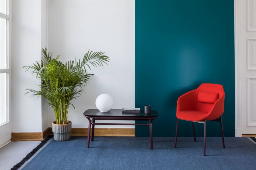
The coastal look requires you to match darker shades of blue with whites and reds, the colours of the characteristic nautical style. A more modern look is a mixture of blue, intense red, yellow and orange. However, without the right level of colour proportions there is a danger of an uncontrolled chaotic space. Dark blue matched with brown works well in retro interiors.
Blue is universal. It finds its place in modern trends as well as classic arrangements. In workspaces it has a beneficial effect on staff, therefore, is worth taking into consideration when planning an interior design.

