In digital world there is only one kind of white: 255, 255, 255 in RGB colour system and 0, 0, 0, 0 in a CMYK colour chart. In reality, however, there are many more shades of the universal colour. A while ago white was present in nearly every room of every household but what followed was a period of time when the colour was practically non-existent from interior design. In recent years, thought, it come back stronger than ever and looks like it’s here to stay. It’s an inspiration to the modern and very popular Scandinavian style, which call for bright, airy interiors.

Presence of white in Nordic design is strictly practical. It reflects nearly 80% of the light, which is irreplaceable in a country dominated by lack of sunlight. An additional asset of the colour is the ability to optically enlarge a room, it’s dominating shade and it can be introduced anywhere we want to highlight space and cleanliness. It’s a colour of courageous and uncompromising people, it symbolizes high quality and professionalism. Thanks to its sense of freshness and purity white is invaluable in areas dedicated to rest.

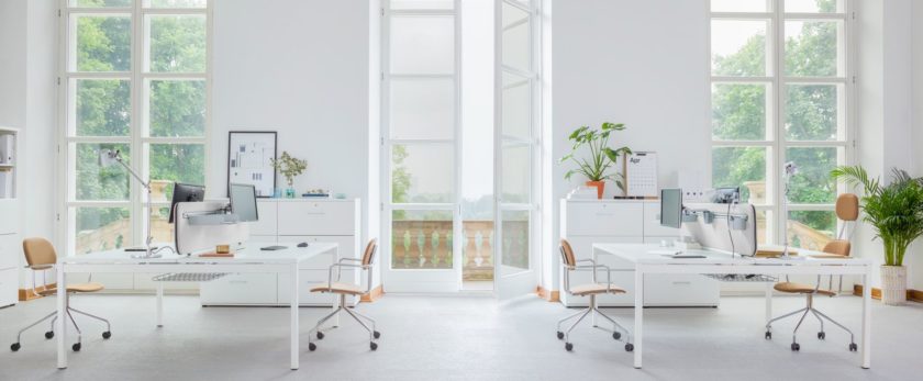
It will not work in a place dedicated to long hours of work if its a dominating element of the interior. That’s due to the fact that exposure to too much light can have a negative effect on receptors of the eyes, make a person more tired and reduce his or hers visual performance. Therefore, it is advisable to introduce white only as an additional element of a design or, optionally break it with another colour. It is easier to work and make less mistakes in a room with clear and bold colours.

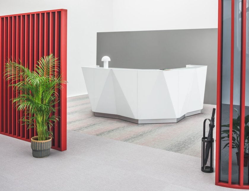
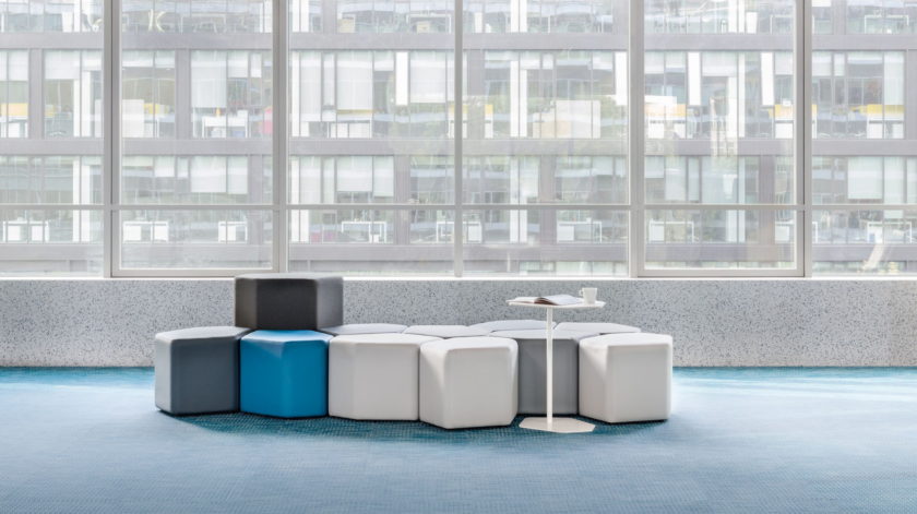
It is interesting to match white with natural wood, green (esp. plants), blue and grey. Black and white interiors are classic and elegant. White is also an ideal companion of furniture and accessories we want to highlight, an expressive design of a shape, colour and texture.