Frederick Beigbeder jokingly said that the purple colour was created by Parisians to stop losers interrupt breakfasts at Café de Flore. The only reason the writer’s words may be excused is because purple has always been identified with prestige and elegance.

Purple elegance
For a number of years high cost of obtaining a desired Purple Tiger dye was the reason only members of royal families and aristocrats could afford it. Nowadays, purple colour is used in perfume manufacturing to underline the uniqueness and sophistication of a fragrance. Purple colour when visible on sweets packaging indicates high quality, in interior design it portrays prestige and social position of the owner. Skilful combination of purple and white can highlight the sense of sophistication and status not only of a product but also a place.
Vivid and bold Ultra Violet was chosen the Colour Of The Year For 2018. Laurie Pressman, Vice President of the Pantone Colour Institute highlighed its visionary, provocative and creative character that encourages us to break the already mentioned stereotypes. Its still used sporadically in interior design as it’s a difficult and demanding colour. However, it carries very positive connotations and is worth introducing in office environment.

Function
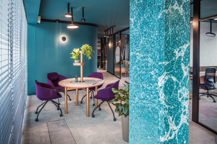
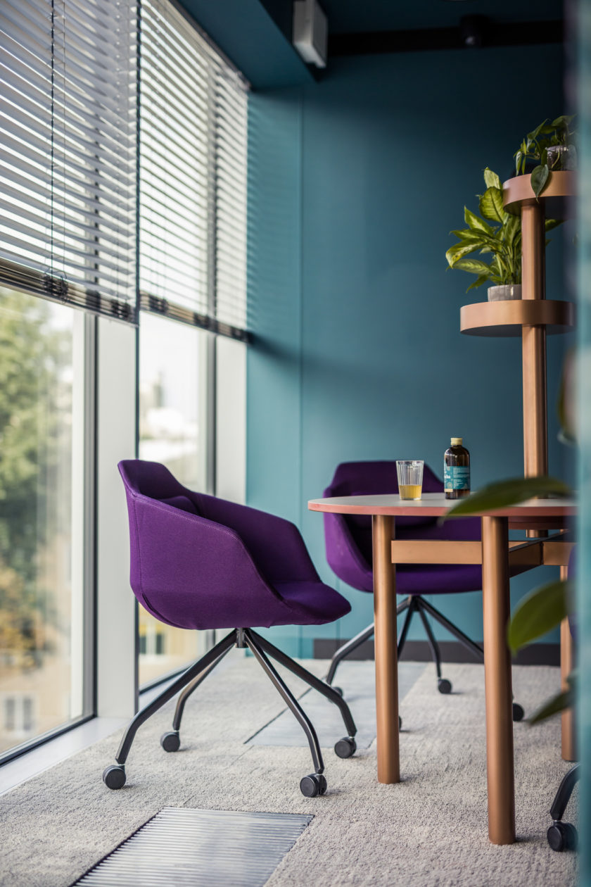
It works especially well for people who prefer to work on their own, in one-man and managerial offices. Deep, saturated hues of purple boost individuality and stimulate creative thinking.
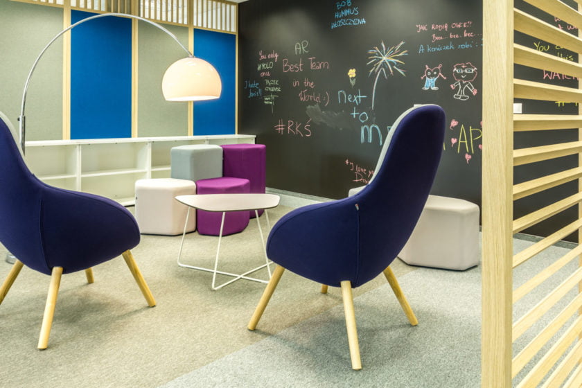
More subdued colours have a calming effect, relieve stress levels and help relaxing. It is not without reason that the colour is linked to spirituality and mysticism, often visible in meditation centres. It works perfect with informal work spaces, as a dominating colour of chillout and lounge zones, used on sofas and chairs.


Colour matching
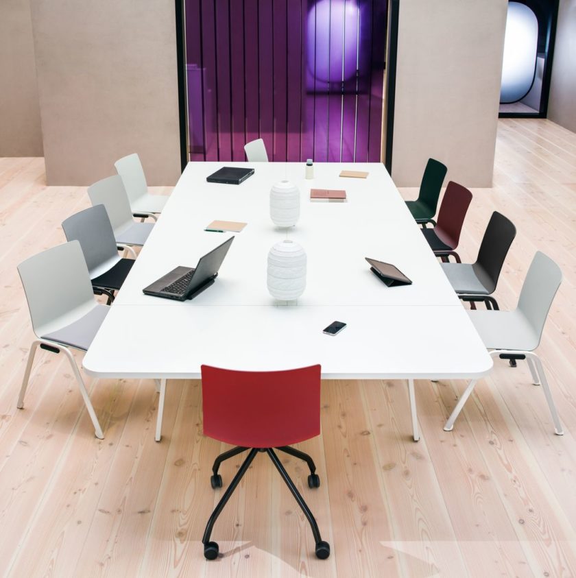
The already mentioned purple and black combination is especially attractive in elegant and official places. Breaking the colour with greys (ranging from very light to anthracite) will encourage rest and employee interactions. The colours will complement each other and gain depth. Matching purple with white will skilfully refer to a very stylish Scandinavian trend; broken with yellow will fit into energetic and modern interiors.
Purple, thanks to its large colour palette, can be utilized in various arrangements and designs; consequently, it encourages us to experiment and try out different ideas and combinations.