Despite the common opinion, colour selection is a hard nut to crack and requires great experience.
Thus, in order to help our customers, we created some graphic inspirations that will help in arranging the ideal interior.
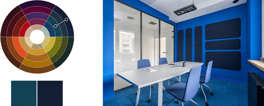
It is surely worth knowing, that the basic tool for creating colour coherent arrangement is the colour wheel.
There are numerous schemes based on the colour wheel that allow choosing the right colours for the given interior.
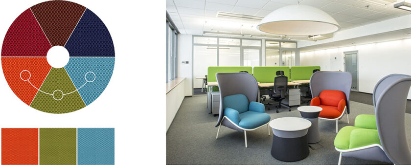
Analogical harmony
Is about mixing colours that are situated next to each other on the colour wheel, for instance, yellow with orange, turquoise with blue or red with pink. Such combinations fit modern interiors and attract attention. It is worth remembering though that too intensive shades of walls juxtaposed with dark coloured furniture may be a bit overwhelming.
Monochromatic harmony
A combination of different shades of the same colour, for instance, sky-blue and navy blue. It is the safest option as it allows creating a neutral and subtle arrangement.
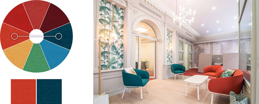
Complementary harmony
Is about mixing colours situated on opposing sides of the colour wheel, for instance, sky-blue and orange. Such combinations of colours constitute a bold interior arrangement thanks to the contrasting colours.