Designers, sales specialists and image creators have valued the role of sensory marketing for a long time but this knowledge has only now started to penetrate into other areas of business. The world has realized how important skilful colour combination and light manipulation is in a workspace.
In 1990 Jean-Gabriel Causse, an industrial designer, expert of a Japanese Onward consortium and an author of many interior designs noticed how underestimated colours and their influence on humans had. In interior design the white and black colours of Minimalism were taking the central stage. Meanwhile, visual experiences count for 80% of all sensory experiences; first we discover colour, then shapes. Originally different shades informed us about coming danger or changes in temperature and stimulated people’s bodies to act. Furthermore, Dagny Thurmann-Moe, an author and a designer indicates that monochromatic white and grey combination is unnatural, and the reason of an increased use of anti-depressants.
If there isn’t enough colour and contrast in the surroundings our brains will search for another object it can focus on. It will switch to a ‘Stanby mode’ and tire itself out. Monochromatic environment can strain the eyes, but we need to remember that too much colour is not welcome either. Overload of colour will limit our concentration capabilities and create chaos.
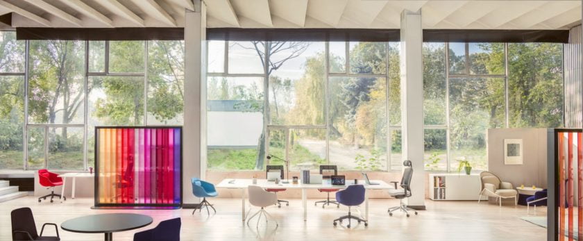
We usually choose lighter and more neutral colours in zones dedicated to work, while brighter colours can be freely used in hallways and building entries. Green, beige and brown with a slight tint of a bolder accent work best as elements of decor. Red boosts our creativity and looks interesting on feature walls or cabinet fronts. If you choose an optimistic orange or green, use it on partition walls or modesty panels as it can perform both- visual and practical function.
While picking the colour of the ‘finishing touches’ we need to take the whole design into consideration. Specific shades when matched together change each other’s properties, either compliment and lighten the room or make it look discoloured and ‘dirty’. Combination of yellow and white or yellow and grey creates a tint of purple, while pairing white with blue produces a yellowy hue.
Colour is in fact impression that the human eye experiences when exposed to light. No surprise shades look different in natural and artificial lighting. The optimal light is the full spectrum and dynamic sunlight, especially beneficial in office environment where employees are exposed to computer screens for a number of hours a day. It is significant that the choice of artificial lighting isn’t left to pure luck, as eg. cold-light illumination can tire eyes. When choosing artificial light look out for one that closely replicates sunlight.
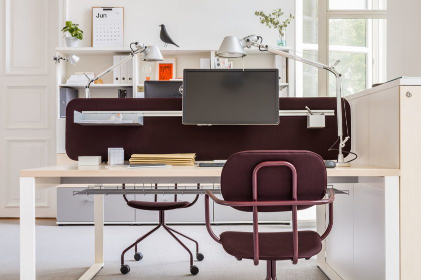
Wrong lighting causes migraines and bad eyesight, it’s a source of fatigue and limits our intellectual abilities. It should always be the starting point when choosing a colour scheme of a workplace; the rule of: the darker the room, the lighter the paint and furniture should apply. It’s also worth noting that lamps, thanks to their custom design have the power to bring together a room and highlight its carefully designed look.